Impact Analysis of Slow-Zones and COVID-19 on MBTA Ridership
by Timothy Clay and Marcus Roldan
Our Project
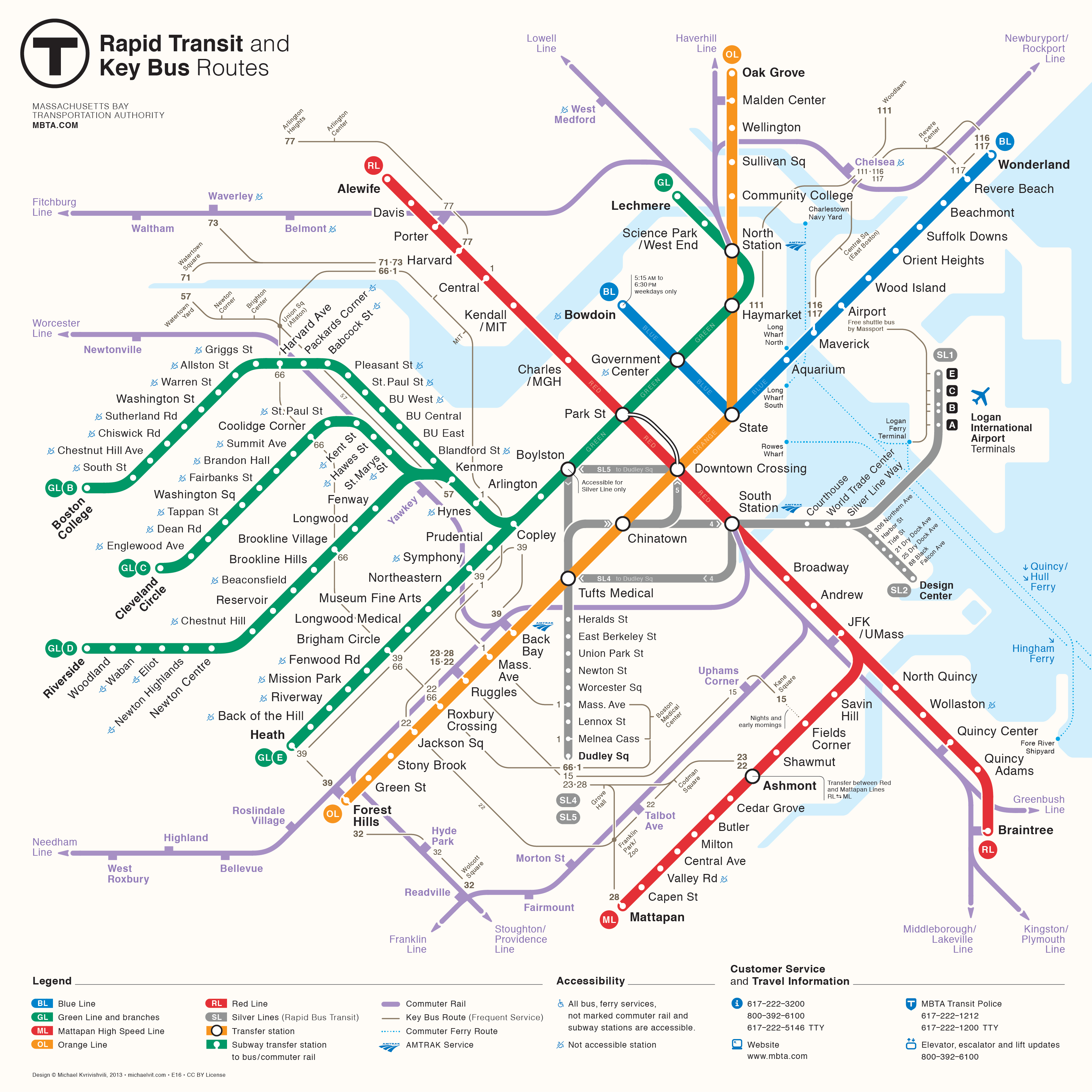
The Massachusetts Bay Transit Authority (MBTA) is, for better or for worse, one of the most well-known public transit systems in the world today. Founded in 1964, the agency has long been a key piece of Boston’s infrastructure, connecting the greater metropolitan area with the city center and serving over 1 million daily riders. The system is composed of several forms of transportation, including subway and commuter rail lines, bus routes, and ferry routes, which many rely on to commute to and from work. The subway system alone sees over 250,000 daily riders, but this number is far from the system's peak of over 500,000, which happened only 10 years ago. While the MBTA still plays a vital role in the transportation plans of many, the system has become one of the country’s most controversial in recent years, leading to this steep decrease in ridership.
The first reason for this sudden drop in ridership is somewhat obvious: the COVID-19 pandemic. During 2020, ridership numbers plummeted as many people stopped their daily commutes in favor of working from home. However, this does not tell the whole story, as other public transit systems, such as New York’s MTA, have seen their ridership numbers almost entirely recover from the pandemic. The real reason why the MBTA is still struggling today compared to their pre-2020 numbers has to do with the agencies seeing a sharp increase in service issues, ranging from minor service delays to train cars literally catching on fire. For a post-COVID Boston commuter, the MBTA’s constant service delays, service cancellations, and speed restrictions make it nearly impossible to rely on the MBTA to consistently get you to work on time.
In this project, we will be taking a closer look at how both the COVID-19 pandemic and the system’s widespread speed restriction issues have affected ridership totals in recent years. In doing so, we hope to pick up on any underlying trends that may further explain this phenomenon. For instance, are all stations being affected by these issues equally, or is it a line- or station-specific issue? Are things at all looking up for the MBTA, or is there still work that needs to be done on their part? Ultimately, we hope to more thoroughly diagnose the MBTA’s current issues and potentially provide direction on how the MBTA may be able to improve the system as a whole in order to return it to its pre-COVID glory.
Data Introduction
Data Source
For our project, we used data collected from the MBTA's Open Data Portal. This tool allows for the dissemination of transit data to the public, organized by type and usage. The two data sources that we used for our project were MBTA Gated Station Entries - Historical and MBTA Rapid Transit Speed Restrictions by Day.
Gated Station Entries
The gated station entries data contains counts of the number of entries to each MBTA station for each 30-minute period since 2014. Each CSV (a year's worth of data) contains a service date, a time period, a stop id, a station name, a route/line, and the number of station entries. Each CSV has just over a million observations. The data dictionary provided by the MBTA is included below.
| Name | Description |
|---|---|
| service_date | The service date of the gated station entries. Times that are within the service date, but after midnight, are listed as ocurring on the previous calendar date, e.g. entries between 12:00:00AM - 12:30:00AM on Jan 2, 2020 is listed as '2020/01/01 12:00 AM'. |
| time_period | The start time of the 30-minute time period, in 24-hour time. Periods starting after 11:59 PM are represented as 00:00 plus their 24-hour time. For example, 1:30:00AM - 1:59:59AM is listed as '01:30:00'. |
| stop_id | GTFS-compatible stop for which gated station entries should be returned; usually provided as the parent station id. |
| station_name | GTFS-compatible station for which gated station entries should be returned. |
| route_or_line | Description of the route or service provided. |
| gated_entries | Property of "Gated Station Entries". Unscaled station entries for gated heavy rail and light rail stations for date and 30-minute increment. |
Speed Restrictions
The speed restrictions data contains an entry for all active restrictions for each day of 2023. This data set has 31 different columns for each observation, including date, restriction ID, and restriction status, among others. The data is broken into 12 different CSVs – one for each month – with some having as many as 10,000 observations. A data dictionary highlighting the most important features is provided below. The full data dictionary can be found here.
| Name | Description |
|---|---|
| Calendar_Date | Date to which the row's information pertains. There is one row per day each restriction has been active since Jan 1, 2023. |
| ID | Unique identifier for the speed restriction |
| Track_Direction | Which track the restriction affects, i.e. Northbound |
| Loc_GTFS_Stop_ID | GTFS-compatible stop_id for restrictions at stations or pipe-separated stop_id’s for restrictions between stations |
| Restriction_Status | Can take values ‘Active Restriction’, ‘Restriction Cleared’, or ‘Restriction Opened’. A restriction will be listed as Active for all dates between when it is opened and cleared. |
| Restriction_Speed_MPH | Maximum speed on track section |
| Line_Restricted_Track_Pct | Restriction_Distance_Miles/Line_Total_Track_Miles |
Data Processing
The two were combined using the shared 'stop_id' attribute. The Speed Restriction data had 'stop_id's contained within the 'Loc_GTFS_Stop_ID' attribute, where the value was either a single GTFS Stop ID, or two IDs separated by a vertical bar (ex: 'place-wimnl | place-aport'). In the Gated Station Entries data, the Stop ID was always a single GTFS Stop ID for each station. Across both datasets, the analysis was restricted to the Green, Orange, Red, and Blue lines, with any data being related to the Silver Line being removed from the dataset.
The Gate Station Entries dataset was reduced from its original size and attributes to create a more condensed dataset tailored to the objective of the project. To begin, three year time-frames were selected for preprocessing. These included 2018, 2020, and 2023, with 2018 representing the peak of ridership on the MBTA in the last 10 years, 2020 containing ridership during COVID-19, and 2023 containing ridership data for the 2023 speed restrictions. For each of these three years, the Gated Station Entries data was aggregated by day instead of by 30-minute interval for each station. For each day, the total ridership was divided between three time-frames within each day: AM Rush-hour, PM Rush-hour, and Full-day totals. AM Rush-hour was defined as 6AM to 10AM and PM Rush-hour as 4PM to 7PM.
The Speed Restrictions dataset was also processed to tailor it to the objective of the project. For each restriction, (identified by its unique ID), all entries were compressed into a single row, and three new columns were added representing the restriction start date, its end date, and the total number of days it was active in the system. This left the total number of speed restrictions affecting the Green, Red, Orange, and Blue lines at 729 throughout 2023.
Final Data
After completing the aforementioned processing steps, the Gated Station Entries dataset comprised daily counts for AM and PM Rush-hour as well as full day totals for every Green, Red, Orange, and Blue line station on the MBTA system for the years 2018, 2020, and 2023.
The Speed Restrictions dataset comprised entries for all 729 speed restrictions which were active during 2023, with attributes describing their location, reasons, length, track coverage, the length of time they were active, as well as their status at the end of 2023.
Reference Papers
The effect of slow zones on ridership: An analysis of the Chicago Transit Authority “El” Blue Line
Our first reference paper is a 2016 paper by Margarita Bernal, Eric W. Welch, and P.S. Sriraj, which examined the effect of slow zones on ridership numbers for the Chicago Transit Authority Blue Line. They used both CTA and user-generated data to conduct their analysis, which concluded that slow zones do have a negative impact on ridership totals, though different types of commuters are impacted differently.
Riding Toward Opportunities: Communities Need Better MBTA Service to Access Jobs
Our second reference paper is a December 2021 study by the Conservation Law Foundation examining the influence chronic MBTA delays has on access to jobs. From this examination, the study found that these delays disproportionately impact minority and low-income communities. Recommendations are made for actions the MBTA should take to reduce the impact speed restrictions have on economic opportunity.
Visual Analysis
To answer our problem, we made and interpreted 5 helpful visuals. Each of these visualizations explores a new aspect of the data, discovering hidden trends along the way. In this section, we will showcase these visualizations and discuss any trends that we found to be important for our conclusion.
MBTA Ridership Over the Last 10 Years:
Our first visualization is a combined scatter and line plot that explores the raw gated station entries data by showing the system's total ridership numbers over the past 10 years. The plot itself is also interactive, allowing for the trends of specific stations to be viewed via a drop-down at the bottom. This drop-down has an option for every station that there is data for (no above-ground stations, like Northeastern), as well as an "All" option that combines all these totals. The plot itself includes three colored lines, which correspond to three different time periods of ridership. The red line (which is always on top) shows a station's average ridership across the entire day. The blue line indicates morning traffic, which is the station's average ridership across the hours of 6-10 AM. Finally, the yellow line indicates the afternoon/evening traffic, which is the station's average ridership across the hours of 3-7 PM. By looking at the relationship between the blue and yellow lines for a particular station, you can easily determine whether riders use that station to go to work or to leave from it. Wonderland, for instance, is more frequently used by commuters in the morning as a way to get to work, while Government Center is the opposite, with more commuters using it as a way to get home.
There are a few key points that we took away from this graph. First, it is very obvious across all stations when the pandemic occurred, with a sharp decline in ridership happening for 2020 and 2021. Furthermore, the system as a whole has yet to fully recover, as we mentioned in our project introduction. Today, only about half of the pre-COVID afternoon/evening commuters are still using the MBTA on their way home, and even fewer morning commuters are using the train. However, certain stations have certainly recovered better than others. Airport, for instance, is already basically back to its pre-COVID numbers, while Harvard has less than half of its pre-COVID riders. This would suggest that differences -- prehaps geographic or demographic -- between these stations has contributed to their varied ridership recovery rates.
2023: The Rise of the Slow-Zones...
Our second visualization is a stacked area plot that explores the speed restrictions data set. The height of the combined bars represents the total number of speed restrictions that have been opened in 2023 before or on that date. For example, by the end of 2023, almost 700 total speed restrictions had been opened over the course of the year. The height of the yellow area is the number of active restrictions on a given day, while the height of the blue bar is the number of closed restrictions. For example, there were just under 200 active restrictions remaining by the end of 2023, while there were over 500 that had been closed by then.
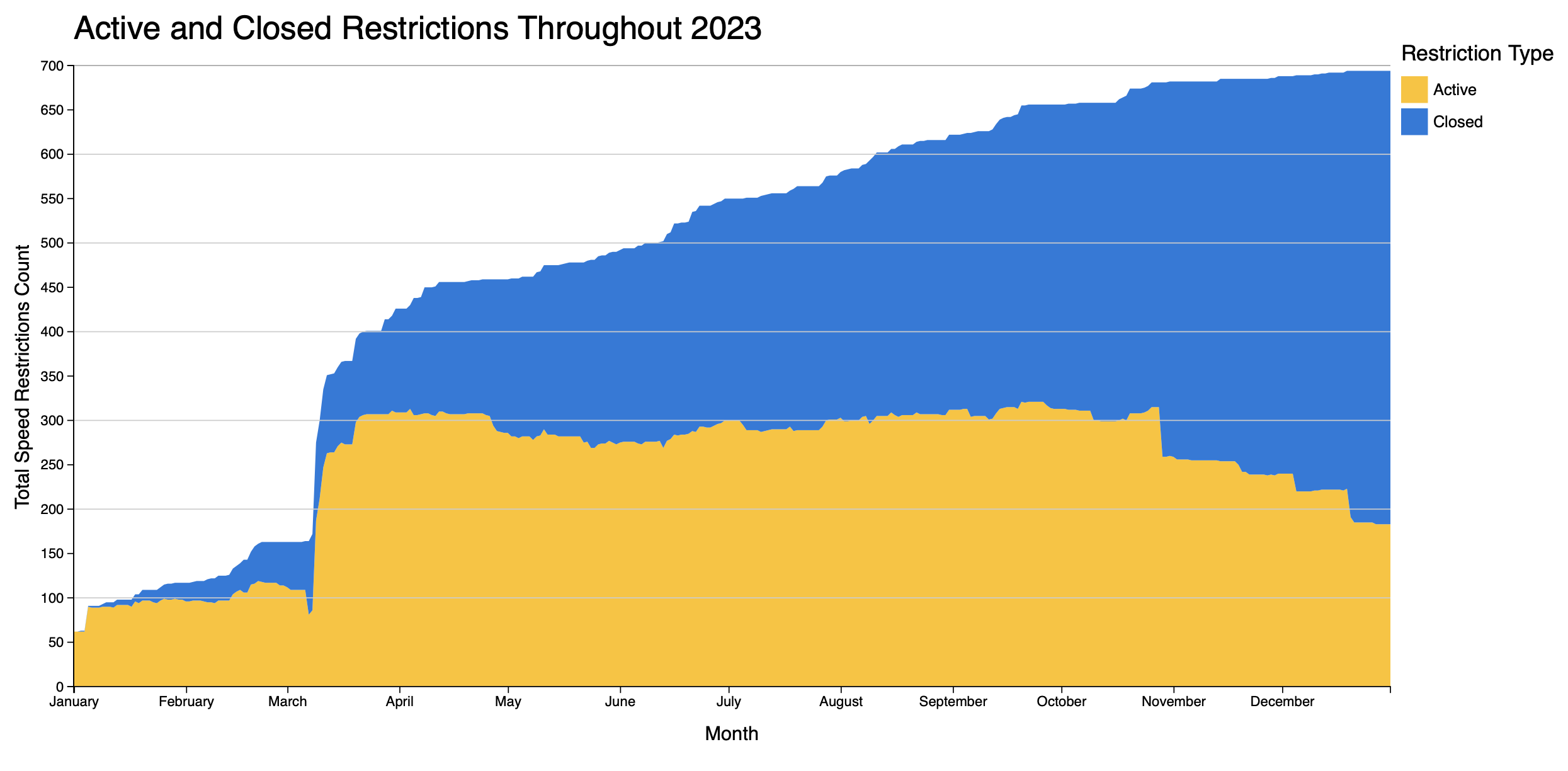
This plot helped us have an understanding on the prevalence of speed restrictions over the course of the year. One thing that jumped out to us at first was the steep jump in active restrictions that happened in March, going from about 100 active restrictions to over 300 in a matter of a few weeks. After doing some research, we found that this was the case after a Red Line inspection by the Department of Public Utilities determined that the track required these restrictions as a precaution. Besides that one aberration, we observed that the MBTA did a good job with maintaining a fairly steady number of 300-ish active restrictions throughout the rest of the year, and even dipping down to below 200 by the year's end. This visualization suggests that, over the course of 2023, speed restrictions were a fairly common issue across the system, so riders likely became very familiar with the service patterns of the agency.
How Extensive was the Problem?
729 speed restrictions sounds like a ton (and it is) of restrictions, but how are they spread across the MBTA's system geographically? How widespread of an issue was the MBTA dealing with here? The following visualization aims to answer these very questions and others like it. By following the link below, an interactive map displaying all 729 speed restrictions and their geographic location within the MBTA system can be accessed, allowing a to-scale look into the size of the problem the MBTA was facing. Feel free to use the filters to reduce the number of restrictions shown by their restriction speed, as well as filtering by station-related restrictions or between-station-related restrictions.
As is very clear even after spending a breif moment exploring the above visualization, the MBTA was dealing with a problem that spanned almost every inch of the system, from Alewife to Wonderland. In order to fix all of these restrictions, extensive logistics and planning was necessary to shuffle around the necessary equipment to every corner of the system to find, diagnose, and treat these issues. Additionally, the restrictions were not limited to a certain type of rail, with both the heavy rail of the Orange line being affected alongside the light-rail tram tracks of the Green line.
Lines of the T: Winners and Losers
Our fourth visualization is a horizontal bar chart that shows the decrease in station entries for each station from their pre-COVID totals to their 2023 numbers. In other words, a longer bar means that that station has seen a smaller percentage of their riders return after COVID than a shorter line. For example, Lechmere, which has the longest bar, has lost almost 70% of it's pre-COVID riders, compared to Airport, which is only at about a 5% decrease. For this chart, we measured each difference using average ridership instead of total ridership. This accounted for any stations that underwent closures in 2023, and allowed us to directly compare one year (2023) with several (2016-2019). Each bar is also colored by the line color that the station is on, in order to detect trends across lines, as well as across stations.
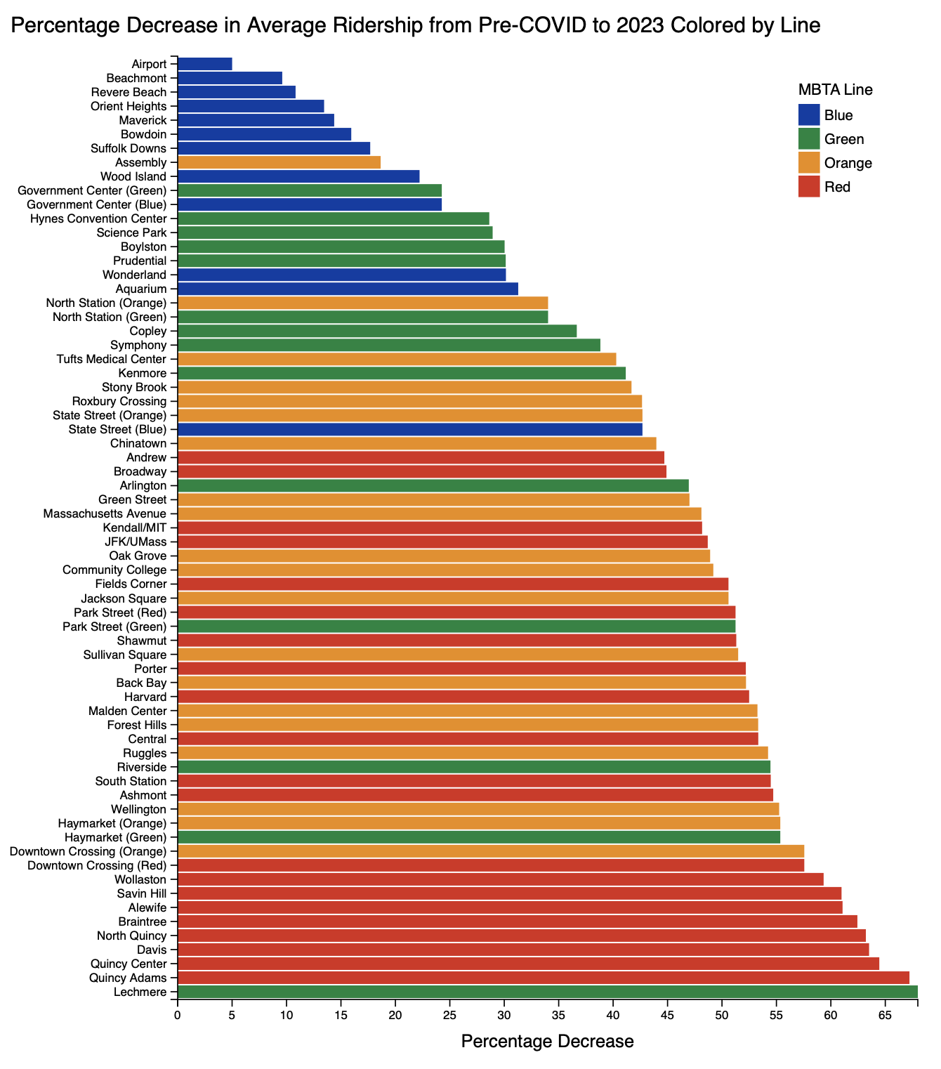
Our main takeaways from this graph have to do with the grouping of stations along the same line. For instance, the top 7 lines and 9 of the top 11 in terms of least decreased ridership are all Blue Line stations. On the other hand, with the exception of Lechmere, 9 of the 10 stations with the greatest decreases in ridership are on the Red Line. These results generally corroborate our findings from previous visualizations. In visualization 1, we observed that different stations have all rebounded from COVID differently, which is supported with this visualization. Originally, we had hypothesized that geographic or demographic diversity may play a role in ridership differences, which is supported here, with the trends you see among Blue and Red Line riders. Additionally, we learned from the second visualization that a significant number of speed restrictions were opened in March due to issues with the Red Line. In this visualzation, we see that Red Line riders are the least likely to have returned to the MBTA after COVID, which may suggest that there is a correlation between amount of restrictions and number of riders.
Slow-zones: Unavoidable Commute Nightmares...
The following visualization is an examination of an individual speed restriction, specifically, one that affected the Arlington, Copley, and Boylston stations in the Eastbound direction from June 14, 2023 to December 5, 2023. These three stacked line charts show the ridership for all three stations in the Eastbound direction, averaged over each day of the week. As can be seen below, weekends clearly have lower ridership. Each line represents a different time-frame and are as follows: average ridership during 2018, average ridership during 2023 while the speed restriction was active (6/14 - 12/5), average ridership during 2023 when the speed restriction was not active, and finally, average ridership during the 2020 COVID-19 lockdown (3/15 - 7/1).
Before making this visualization, we expected the speed restrictions to have a large impact on ridership, but this was not the case across all speed restrictions. The impact of the COVID-19 lockdown on ridership is very evident in this visualization, but the impact of the speed restrictions are negligable across all three ridership totals. After taking these findings into consideration, we revised our hypothesis to better reflect human behavior and the story the data visualization was telling.
During the COVID-19 lockdown and the months afterwards, those who were still commuting into work or were beginning to commute into Boston again chose other means of doing so if they were able to (i.e. buying a car, carpooling, etc.) which likely reduced the amount they used the MBTA system entirely. Those without the ability to commute in other ways still took the T, but when speed restrictions were put in place, they did not have the ability to quickly change their commute mode, meaning they had to still use the T despite the increase in commute times. For this reason, those without the resources to commute in other ways (typically from lower-class backgrounds) had their commute times worsen during the speed restrictions, but the ridership did not increase. This only serves to underscore the importance of public transit and the MBTA system, as even for many people it is the only viable option to commute to their jobs in Boston.
So what?
Overall, our visualizations were extremely helpful in beginning to understand what is truly going on with the MBTA today. As the visualizations showed, the MBTA is clearly struggling with ridership following the COVID-19 pandemic, but it appears that the speed restrictions may not be a root cause of the issues. We think that this might be the case for a couple of reasons. First, compared to other service changes, like delays or cancellations, speed restrictions are by far the least noticeable. In other words, you often times don't realize that there is a speed restriction in place until you're already on the train, at which point it's too late to choose another transportation option. For this reason, speed restrictions would be far less likely to drive someone away from using the MBTA than any other change in service. Additionally, though speed restrictions are definitely driving away passengers, we believe that the sheer amount of speed restrictions is more of a deterrent than any individual restriction. This is because the number of speed restrictions on any line reflects that line's maintenance quality and overall safety. If a line has a large number of speed restrictions, people may not want to use it to get to work because they worry about whether they are safe to ride the trains. For these reasons, we feel comfortable concluding that, while the increase in speed restrictions and the decrease and ridership numbers are definitely correlated, there is not a causal relationship between the two.
Over the course of the project, we also picked up on several secondary trends. First, the difference in ridership recovery rates between Red Line and Blue Line stations -- as visible in our 1st and 4th visualizations -- was interesting and unexpected to us. After doing some further research, we now hypothesize that these differences are a result of demographic differences between the communities that these two lines serve. More specifically, the Blue Line serves as the main connecting point between East Boston and the downtown area, while the Red Line primarily connects the city with Dorcester and the South Shore. According to a 2016 study by WBUR, a whopping 57% of East Boston residents rely on public transportation to get to work, while only 36% of Dorcester residents do. This would suggest that, generally speaking, those who rely on the Blue Line to get to work for the most part do not have any other options for commuting, whereas the Red Line riders do. For this reason, our hypothesis is that when the pandemic struck and most everyone stopped using the train to get to work, Red Line riders started to use other methods to get to work, and have continued doing so ever since. As the MBTA has continued to have service issues, more and more of these Red Line riders have defected to other forms of transportation, while Blue Line riders have had no other option, hence why their ridership numbers have almost entirely recovered.
Our analysis could lead the MBTA to proceed in a couple of different ways. First, they should likely prioritize changing the public's overall perception of the MBTA today. As mentioned previously, we concluded that the MBTA is likely seeing these drops in ridership in part because people don't trust the trains to get them to and from work safely. As the MBTA continues to clear speed restrictions (which they were trending positively for, as seen in our 2nd visualization), they should promote these and emphasize to the public that the percieved issues are not as bad as they may seen. Additionally, if our second hypothesis is correct, the MBTA should prioritize servicing the Blue Line over the Red Line, since those riders more desperately rely on the trains for their daily commutes. If speed restrictions or service changes are needed on this line, the MBTA should try to clear them as fast as possible due to the demographic identity of the region. Overall, using this analysis as a general framework, the MBTA should pursue future research into the areas that we have identified to determine the best approach to take moving forwards. While the situation does not look great right now, we sincerely hope that, with careful attention to the communities they serve, the MBTA will successfully be able to recover to their pre-COVID prominence and remain a major part of the greater-Boston area infrastructure.
If you have any further questions or ideas on how to continue this research, please feel free to reach out to us, as we would love to talk more about this topic. Thank you!
Timothy Clay (clay.t@northeastern.edu)
Marcus Roldan (roldan.m@northeastern.edu)